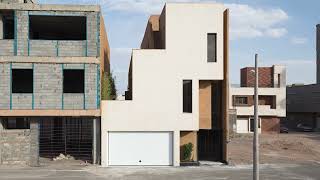
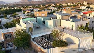
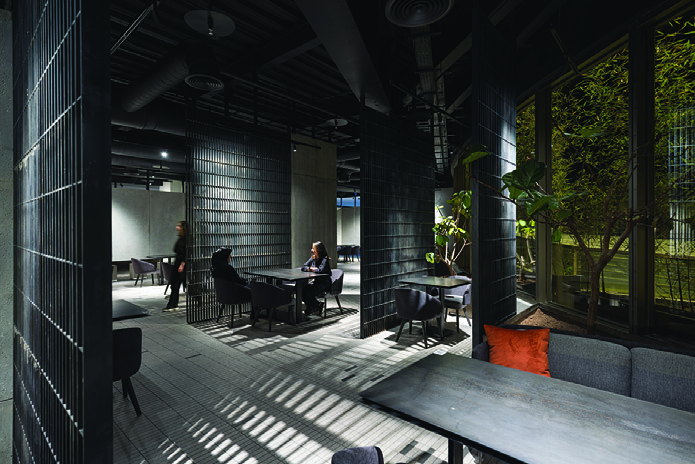
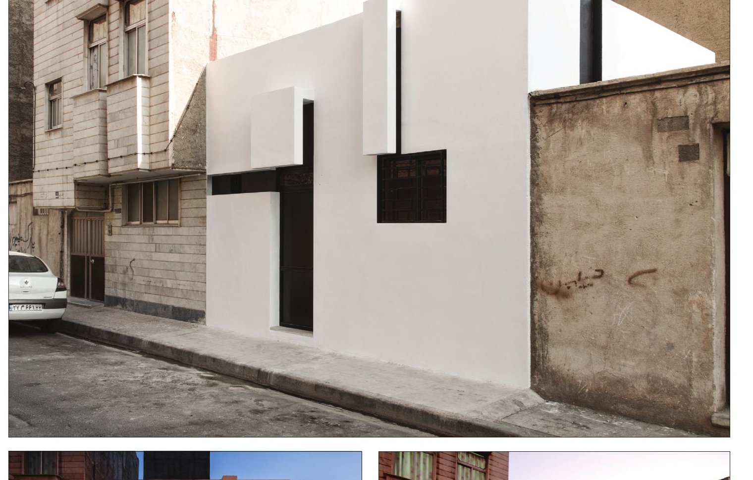
The Renovation category of the 17th Memar Award gathered three medal-winning projects that approach the question of building reuse from very different angles. The first prize went to a small NGO kitchen in southern Tehran that uses the renovation of a single 50-year-old, 90 m² house as a vehicle for social empowerment of women in a poor migrant neighbourhood. The second prize went to a gallery in a quiet Tehran lane, where a single-family modernist house and its wartime bomb shelter were re-cut into a sequence of fluid, connected exhibition rooms. The third prize went to a tile showroom in Hamedan, where a closed, three-storey commercial building was opened up and reorganised around the rituals of choosing and arranging tiles.
1st Place — Aabaan Kitchen, Tehran
Location: Azadegan Highway, southern Rajaee Boulevard, Sizdah Aban Alley, Rezazadeh Alley, Shahbazi Alley (4th Khordad), No. 26, Tehran · Client: 13th of Aban Women's Cooperative (NGO) · Photo & Presentation: Hamed Karami, Hamid Karami · Construction: Majid Zamani, Ali Ghoroghi, Armin Alaee · Area: 90 m²
This project is for the social empowerment of women in this neighbourhood of Shahr-e-Rey. The users of the kitchen began their work in the mid-1370s (mid-1990s) from a small, unsuitable rented space, offering limited services to their neighbours. After about twenty years of effort and growth of the business, and with the help of charitable NGOs, they were able to buy an old house in the neighbourhood. The proximity of the local bazaar and the group's emphasis on the easy daily procurement of ingredients drove the choice of site.
The 13th of Aban estate in Shahr-e-Rey was built in the mid-1340s (mid-1960s) to settle shack-dwellers and slum migrants to Tehran, on 84 m² plots. Roma (from the back of Yazd mountain), Nahavandis, Arakis, Lurs of Tuyserkan and Afghans live alongside the older residents of the lane, forming today's social fabric of the neighbourhood. Because of the slum history of the place, the fabric carries problems that are more or less accepted by the residents.
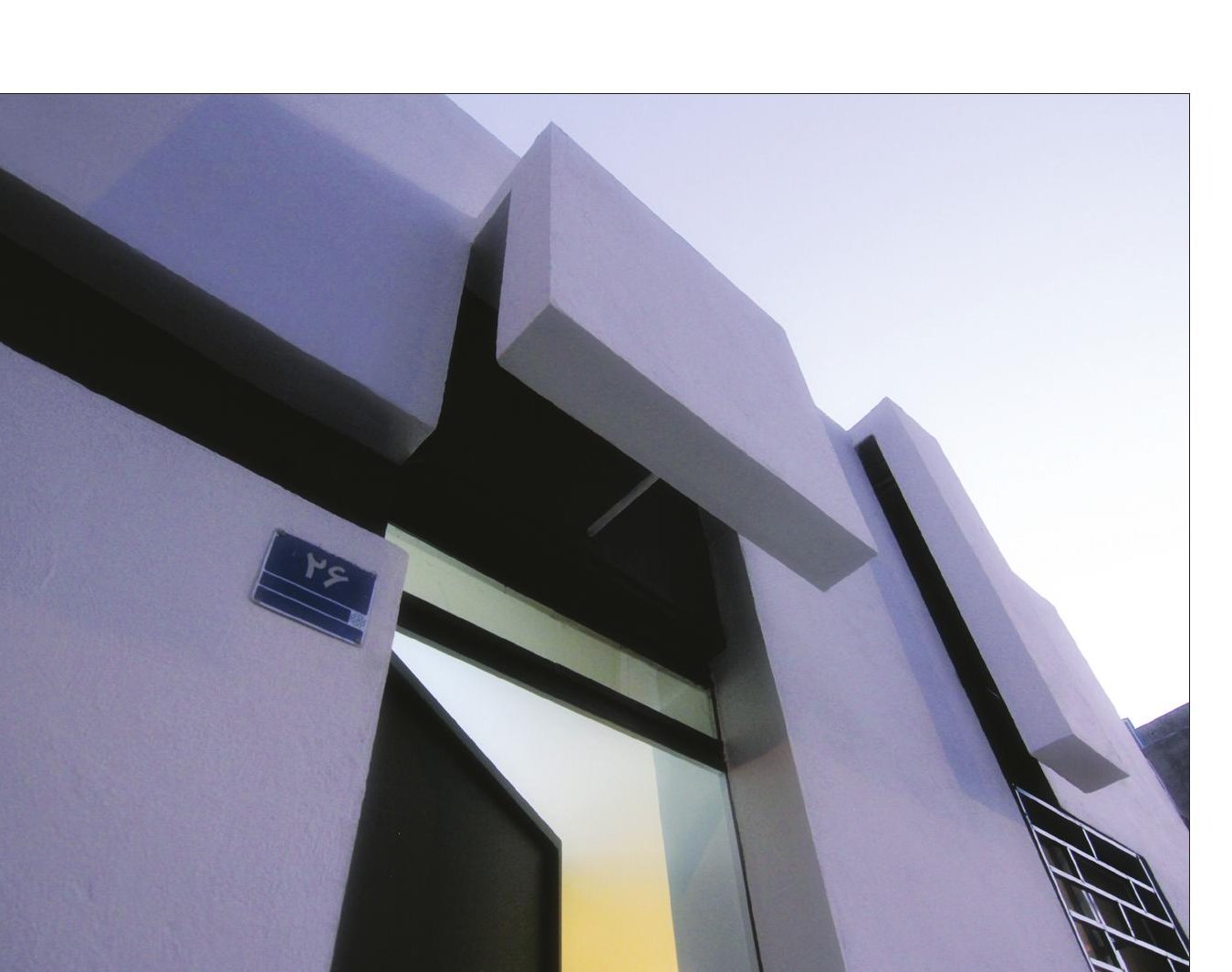
The design and construction team's entry point was an invitation from the Women's NGO to renovate and redesign a space, and to change it from a residential space into a kitchen — as a free service offered by the design group. At the large scale, two parallel approaches were defined: a physical engagement with a single building requiring its most basic services with a very limited budget; and an engagement with the building's role at the scale of the urban landscape. In a social and physical fabric where visual pollution had become routine, a white, pure facade was proposed as a counterpoint to the existing condition and as an attempt at visual cleansing whose effect could reach beyond the project's boundary. A third dimension was an attempt to place the role of working women on equal footing with the role of the urban landscape — the project tries to introduce an alternative way of living in such a context for women.
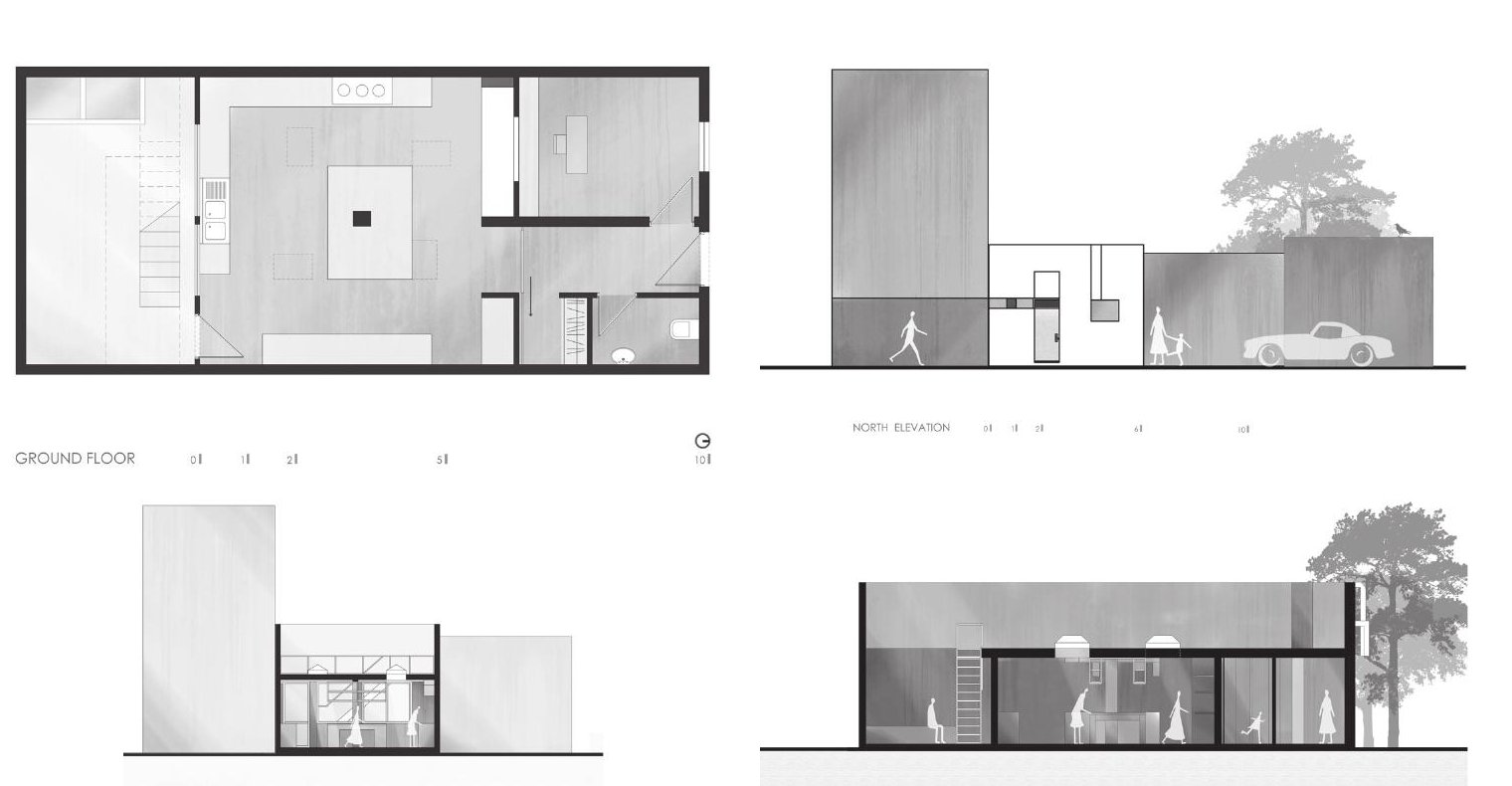
The interior renovation had to be carried out on several levels: from the bottom of a pyramid of basic needs (water supply, sewerage, gas and ventilation channels that the building lacked), to major repair of the roof's covering and waterproofing, supply of natural light, and the provision of the hygiene requirements of a food-production space (which absorbed a large part of the limited budget of 30 million Toman) — so that attention could then be paid to spatial design. The group's approach was a strategic management of limited resources, allocating them according to rigorous priorities driven by severe economic constraints. The project's time limit, which did not exceed two months, also demanded a design that, in addition to addressing the constraints, would allow ease and speed of construction.
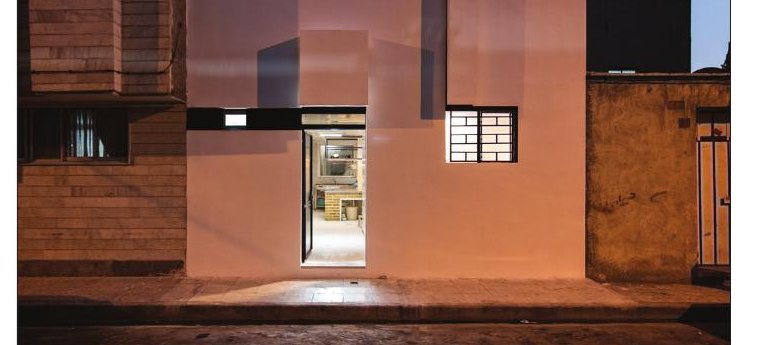
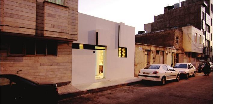
The building was a load-bearing masonry structure more than fifty years old, which made any intervention difficult. During the construction process, given the empowerment approach, much of the local labour and the clients' immediate neighbours were used. The clients' initial brief did not go beyond a minimal supply of necessary services, and there was no appetite for renovating the facade. Through the course of the work, the importance of spatial quality — through the introduction of an example that was economical, efficient and at the same time beautiful — persuaded them to include the facade in the renovation programme. Beyond that, during construction the neighbours, seeing an economical but beautiful alternative, asked the group to renovate their houses too. The architects in turn made their own proposal to improve the neighbourhood: the facades of all the remaining one-storey houses from the 1340s could be renovated and painted with the participation of the municipality and the residents, so that by raising the social participation of the residents and their sense of belonging to the neighbourhood, the project could provide at least a service at the scale of urban landscape improvement.
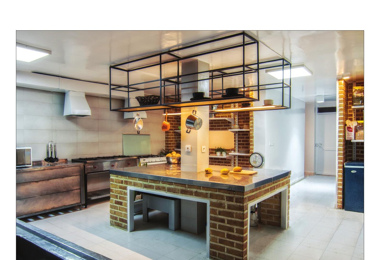
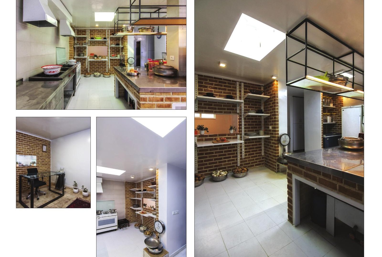
The plan is organised around three main parts. The first layer, an administrative section where orders, customer responses, accounting and sales management are handled, sits at the immediate entrance and separates clients from the food-preparation area that has stricter hygiene requirements; a window into the kitchen still allows visual contact. The second layer is the service spaces, including bathrooms and a staff changing room. The third part is the work zone, where preparation and cooking are carried out. Its focus is a central work table; from here, in one rotation, one has easy access to the three main areas of the kitchen — cooking, washing and refrigeration. The addition of skylights provides natural light and reduces dependence on artificial light, while exhausting the warm air from cooking and giving natural ventilation — a more sustainable solution that reduces lighting and ventilation costs. The openings on the north and south sides of the plan, and the openings between the administrative and cooking spaces, also allow cross-ventilation.
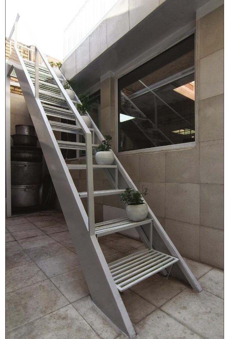
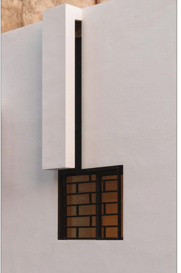
The architects' hope is that this project, working with minimal resources, can lay the ground for social change toward the empowerment of women and their active presence in social and productive life, as an example of development at the local scale — increasing the sense of belonging to the environment and increasing participation in social activities.
2nd Place — Nabshi Gallery, Tehran
Location: Villa Street, Khosrow Alley, No. 51 · Client: Ehsan Rasoolof · Design associate: Yegane Ghezelloo · Construction: Roshanak Sajadian · Construction associate: Mehdi Mahootian · Supervision: Fateme Rezaie Fakhr-e-Astane · Structure: Jalaleddin Sajadian · Electrical: Mahdi Ghandilzadeh · Mechanical: Reza Sarlak · Landscape consultant: Maryam Yousefi, Morteza Adib · Graphic: Yegane Ghezelloo · Photo: Parham Taghiof, Soroush Majidi, Farid Golmohammadi · Total built area: 600 m² · Area: 510 m²
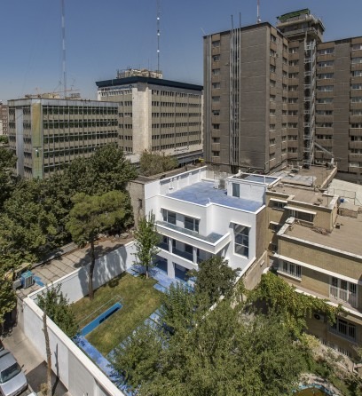
A chance to practise creating a contemporary space inside the central fabric of Tehran was offered here by a friendly and knowledgeable client. The change of function of a house into a design gallery has been studied as a present-day proposal for bringing the city's abandoned spaces back into the cycle of use, without any of the usual "prejudices". The aim is for forward-looking groups to be able to continue their contemporary activity in central Tehran and contribute to preserving its fabric. At the height of its time, central Tehran hosted these same audiences; it is one of the surviving valuable fabrics of the city. The building's architecture, designed by Dr. Paknia, stylistically belongs to the early "modern" type of Tehran architecture.
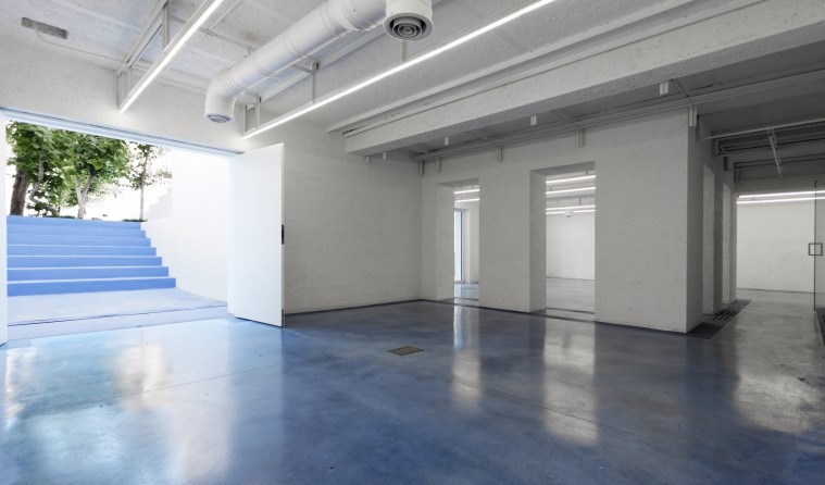
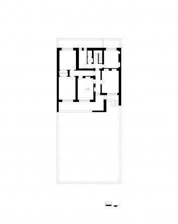
The family who lived there during the war years, while preserving the house, had built a shelter in the courtyard to escape air raids, and changed how the spaces were used; today that shelter has become a memorial space for the late photographer brother of the client. Opening the shelter onto the courtyard and extending the courtyard into the closed basement, creating continuity and connection between the spaces — together with the removal of selected walls and the opening up of the spaces — set up a quality of space reinforced by the careful resolution of the construction details. Migration to the centre of the city has today become a common thing; guiding this wave of migration can curb the north–south imbalance of Tehran that reached its peak in the war and reconstruction years. It is as if the building carries in itself a memory of different periods of contemporary Tehran's history — periods that some historians reduce to the eras before and after the Iran–Iraq war.
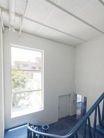
South, North, Centre — Visitor, Architect / Golnaz Khosravani
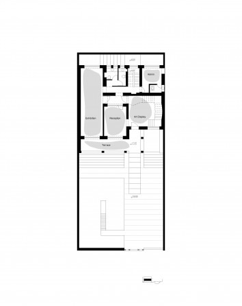
As you enter the courtyard, a blue ground takes you in — a courtyard meant to host artists for the display of their work. To the side, on the lawn, you see a crack from which the blue colour seems to have come out. This is an installation made in memory of the late artist brother of the gallery's owner, on the site of the former shelter. As you come further in, a flight of steps in front of you defines two paths. From the broad steps that you go down, you reach the ground floor; if you continue, you arrive at a narrow, light-filled courtyard punctuated by deep steps which becomes your destination. The stair invites you to move on it and brings you up to the first floor. If you refuse the invitation of these steps, you can take another route which is, in fact, the entrance to the ground floor, return to the courtyard, and this time take the central stairs and find yourself in the first-floor entrance hall in front of the temptation of a figurative stair — a survivor of the building's old architectural language.
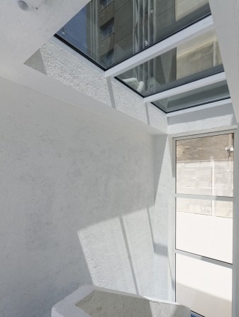
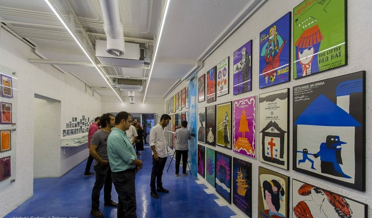
The ground and first floors of the building are the permanent and temporary galleries, working with service and reception spaces, while the second floor is the territory of the gallery's management and staff. All the spaces, which are linked by an illuminated stair-box, share a blue floor colour. The blue is under your feet and makes the route. The courtyard steps, the main-entrance steps, the steps of the rest courtyard, the figurative steps and the steps of the old stair-box are, like the rest of the routes and floor surfaces, all "of the same family". The steps are connecting routes which are themselves part of a continuous space — while the spaces are also connected to each other. The continuous internal voids, of the same material and the same colour, all signal the integrity and continuity of the space. There is no boundary between the spaces, or it is so faint that it cannot stop the fluidity of space. Whichever path you take and whichever space you stand in, an opening or a flight of steps connects you simply to the outside and allows you to extend yourself, as if "this space has no end".
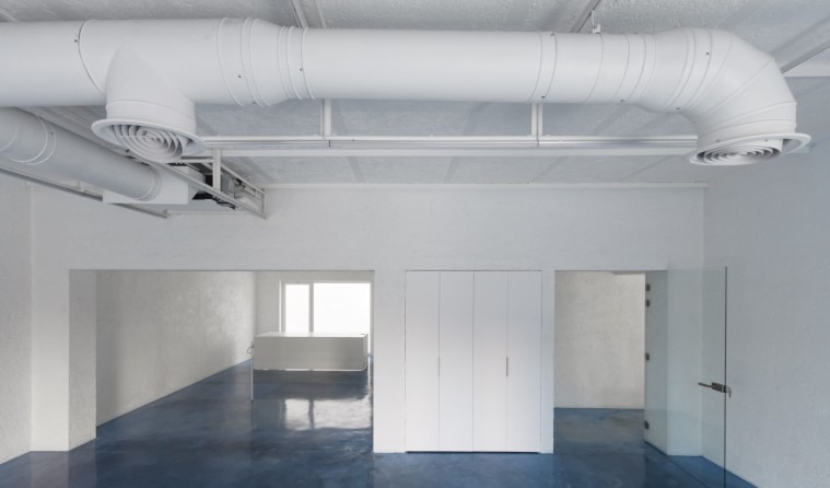
In creating the interior spaces, no new walls have been added (except transparent ones); rather, the existing walls have been removed where necessary or made porous, so that in addition to forming a three-dimensional open space, the space does not dictate to the visitor and the visitor can freely see themselves as part of the space. Resolving the details masterfully has reinforced this feeling in a tangible way. Unnecessary detail — with its emphasis on human power over construction technology — would have caused the space to dictate to the user; that has been avoided here, and the necessary details have been integrated into the other elements in the best possible way.
3rd Place — Sales Representative of Tabriz & Keraben Tiles Co., Hamedan
Location: Madani Boulevard, opposite Imamzadeh Yahya, Hamedan · Client: Payvar Tejarat Co., Morteza Bayati · Design team: Raziyeh Shoaee, Seyyed Akam Katoorani, Elaheh Afrookhteh, Alireza Moradimeshkin, Sonbol Hatami, Hooman Saadat · Construction: Seyyed Jalil Mousavi, Seyyed Akam Katoorani · Structure: Keyvan Salevati · Electrical: Meysam Shokriyeh · Graphic: Sepehr Edalati Morafah · Photo: Ali Daghigh, Ata Mobaraki Novin · Total built area: 352.70 m² · Area: 94.51 m²
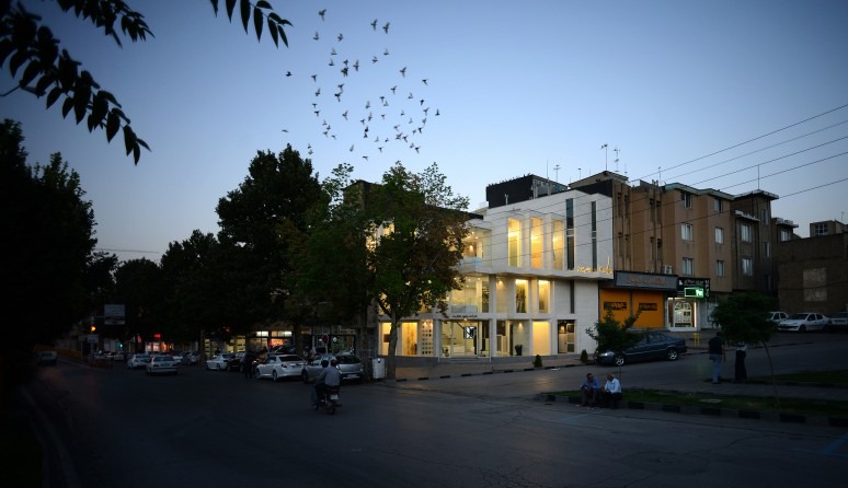
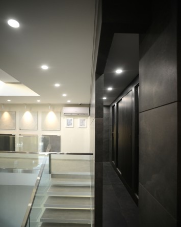
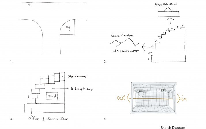
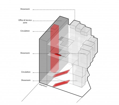
The showroom had been changed three times during the last twenty years. The last time, at the request of the tile manufacturer (Tabriz and Keraben), the building's facade had been clad in composite panels — but none of the changes had ever satisfied the owner and the company. Two things stood out in the survey of the building: first, that the spaces were closed and the floors were poorly connected — visitors had no idea what was on the upper floor (a closed display space) or in the basement (the auxiliary products); and second, the difficulty for customers of choosing a tile, because of the great variety on offer and the impossibility of imagining how it would be arranged in their chosen space. These two issues became the basis of the main idea of the renovation: transparency between the spaces and a clearly defined circulation through the floors — so that visitors, on arrival, can immediately read the dimensions of the whole space and move between floors as in a gallery; and a careful study of how customers behave when buying tiles, where the two important questions are the choice of colour, dimensions and texture (made by handling and touching the tile), and imagining how it will be arranged in the chosen space (the buyers' main challenge). "Touch and imagination" together with spatial transparency therefore became the central subjects in shaping the renovation of the shop.
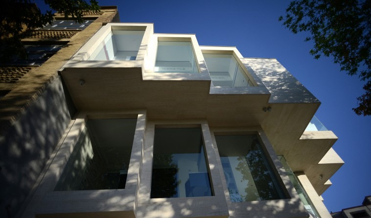
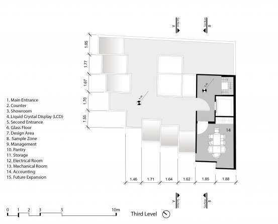
Cubes of different dimensions, matched to the size of the typical bathrooms and service rooms used inside houses, were set into the main body of the building — and as vitrines, they form the boundary between inside and outside, so that beyond the customers, passers-by also see different arrangements of tile and ceramic which, by changing the tiles inside them, allow the facade to be permanently re-curated.
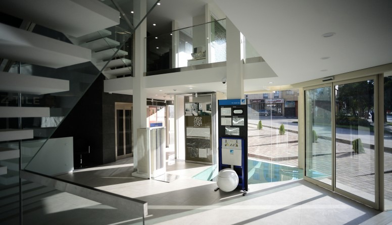
On the other hand, a space for digital design and arrangement of various tiles and ceramics was provided. Customers can give the dimensions of their intended space to the operator, and arrangements are made on their own preferences and shown on a large display next to the cash desk so they can see the result. Drawing both from the visit to the physical display spaces and from the maximum software-based digital display, the support given to customers in choosing and buying is significantly increased.
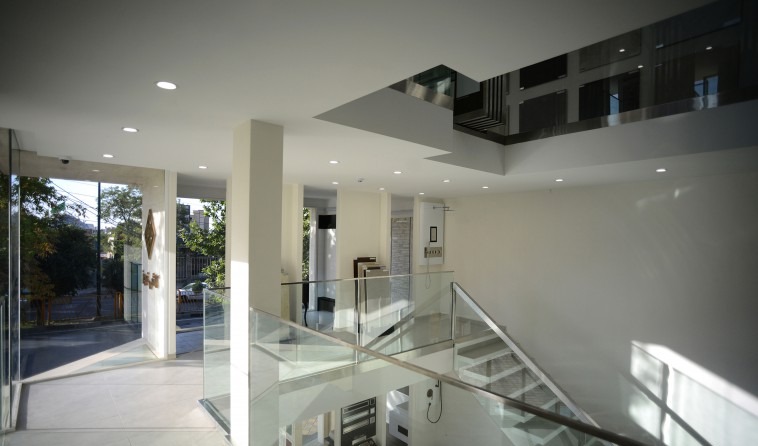
Another point in the renovation was the conversion of what was effectively a mezzanine of the shop — usually treated as second-hand space and used as storage — into a floor that gives access to the upper vitrines and forms the link between the ground and second floors. As a result, it can no longer be read as the mezzanine of a shop but as the first floor. "Seeing, touching, designing and displaying, choosing and buying" have, in this project, become a pleasurable feature.