Architect: Frank Gehry
Location: Bilbao, Spain
Year: 1991–1997
Area: 24,000 sqm
Client: Solomon R. Guggenheim Foundation & Basque Country Government
Original source: “Bilbao Guggenheim,” l’architecture d’aujourd’hui, No. 313, October 1997
The Basque heartland of Spain is in dire straits: its economic foundations are crumbling and unemployment is soaring. The municipal and regional authorities of the Basque Country have launched a major development programme in the city of Bilbao to halt this decline. A striking building has become the vanguard of these improvements: the new Guggenheim Museum, designed by the Californian architect Frank Gehry. The creation of this building has several dimensions: a political dimension that takes on urban and architectural form; a programmatic dimension involving the purchase of a franchise from the American Guggenheim Foundation; and a constructional dimension that operates on a level of masterly brilliance.
With the building set to open in mid-October, we seize the opportunity to welcome an event that embodies the incarnation of architecture in the fusion of a talent, an opportunity, and a policy.
Background
The construction of the Guggenheim Bilbao is part of an immense plan for urban renewal in a region whose particular economy — metalworking, chemicals, and shipbuilding — has fallen far behind and is gripped by crisis. Moreover, this building signals a new strategy in the world of art and museum management, one derived from the theory of commercial franchising. It is therefore as much an architectural event as it is a step toward globalizing cultural exchange, delocalizing everything, and imposing the standards of financial centres on the art market.
In earlier editions of the 1,300-page guidebook to Spain, only four pages were devoted to this Basque city. You could see the whole town in less than two hours, provided you made a hurried visit to the Fine Arts Museum as well. After that, farewell — you could head off to the coast. This port city, which most of us knew only by name from Brecht and the Basque folk song of Kurt Weill, was one of those places easily forgotten, left buried in the world of maritime industries and pre-war novels, steeped in the seepage of sea spray and fish oil. All of this is set to change with the opening of this Guggenheim, which has been built for 150 million dollars. The region hopes that spending such a sum will attract hundreds of thousands of tourists — precisely 547,547 visitors, as the bizarre feasibility study of 1992 declared.
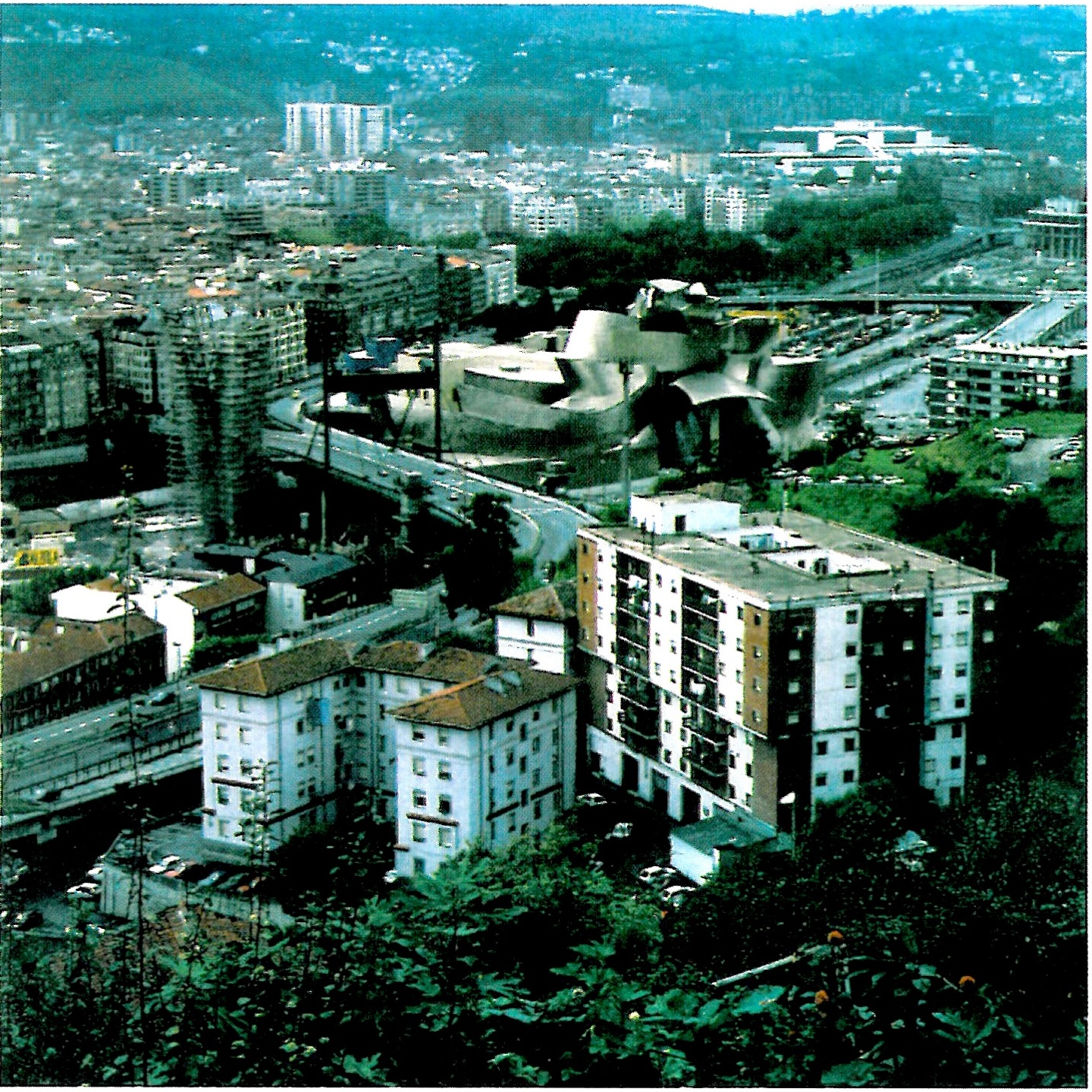
This sea monster made of plain metal creates a mesmerizing spectacle against its backdrop: a frozen leviathan with multiple humps and hollows, a titanium whale beached on the banks of the Nervion, beneath a motorway overpass that seems to want, in one final shudder, to swallow it whole. More than a functional building, it is a sculpture: an architectural statement, an extravagant sign of the desire for renewal. Its emergence was tangled, sometimes farcical and often murky — the kind of story a whole book could be devoted to.
The governance of the Guggenheim Bilbao Museum is twofold: financing and management are the responsibility of the Basques, but artistic oversight rests with the Guggenheim Foundation, which, through a system of exhibitions, has assumed institutional guardianship over museum collections displayed under its name. This unprecedented fusion raises a variety of questions: Is this a form of cultural imperialism or a novel form of patronage? Does this dual oversight guarantee the museum’s independence?
In a controversial book published in Spain, Chronicle of a Seduction presents what was certainly a two-sided swindle. Its author is a Basque anthropologist, Joseba Zulaika, who has been teaching in Nevada since 1990. He took the word “swindle” from Jean Baudrillard, whom he quotes at the opening: “We have been told that everything depends on production. But if everything depends on the swindle, then what?” And swindle is the word because, according to the author, Thomas Krens, who has been president of the Guggenheim Foundation since 1988, once confessed to him:
— Thomas Krens, President of the Guggenheim Foundation
The brokers controlling this small world are the art market and the international financial system; the customers are politicians and members of local government. The shadowy roles are played by men in the wings — most importantly the Venetian Socialist Gianni De Michelis, former foreign minister of Italy and member of the Guggenheim Foundation’s board of trustees, embroiled in an eighteen-month financial scandal and sentenced to four years in prison. If Zulaika, as it appears, has fallen under the spell of Frank Gehry and describes him as likeable, direct, and even “a little naively swayed by the Basques,” he shows no such mercy to Thomas Krens, whom he describes as an “American afflicted by megalomania” with a “hypnotic” fervour, a master at concocting all manner of “pharaonic exaggerations.” All the same, he denies that he wanted to write “the history of a crime or a scandal.” He claims that, as an anthropologist and lecturer wishing to investigate the methods of deceivers in power, his sole aim was to expose “many of the ironies of the present time” and the “complex blend of urbanism, economics, advertising, art, museum management, and the recent turn to millennial celebrations” that have been parasitic on Bilbao — and, more generally, the military-style manoeuvres that will inevitably be scattered around the world.
After an attempt to build an addition to the Guggenheim’s fifth-floor space in SoHo — which left the foundation with serious financial difficulties — it is said that Thomas Krens devised a brilliant scheme for granting franchises worldwide, enabling various cities to build branches of the museum entirely at their own expense and thereby be guided from New York. The American press called these projects the “McDonald’s of art.” McGuggenheim. No museum had ever before thought of granting a franchise. It had not even occurred to anyone to introduce a commercial concept into the realm of art — one that had been operating as a system since around 1955 with the multinational fast-food corporation.
Earlier, in 1988, the Austrian collector Felix Unger had suggested opening a branch in Salzburg — a city with a vibrant musical life that attracts two million tourists each year (only 200,000 of those come to visit the house where Mozart was born). In 1989, Hans Hollein proposed an intriguing cave-like project for it: a spiral carved into a cliff face, reminiscent of Frank Lloyd Wright’s famous building. But very quickly, Krens’s “arrogance and tactlessness” soured relations, and in July 1990, when the museum director arrived five minutes late to the opening ceremony of a Guggenheim touring exhibition in America and said he had been taking a bath — without apologizing to the 800 guests who had been waiting to hear his speech — relations were severed entirely.
Meanwhile, Thomas Krens had opened negotiations with several other cities around the world. With the help of De Michelis he tried to seize the site of the beautiful Dogana da Mar building in Venice, which caused a huge uproar in the Italian press. In Spain, contacts were also made with officials in Madrid, Seville, and finally Bilbao, where a plan for a museum of modern art had languished for years. The authorities in Bilbao showed interest in his proposal. Before any discussion could begin, Krens immediately demanded a franchise fee of 15 million dollars — later raised to 20 million — simply for placing the necessary technical know-how at their disposal. The Foundation in New York (which Krens claimed was worth 500 million dollars) was in fact up to its neck in debt, largely because of the addition by two architects named Gwathmey and Siegel and the purchase of the 22-million-dollar art collection of the Milanese Count Giuseppe Panza di Biumo.
In April 1991, the officials of Bilbao — having laid on a helicopter, rolled out a red carpet, and arranged all manner of ceremonies — welcomed this tall, former volleyball-playing figure with metal-rimmed glasses, a gabardine coat, and a portable computer in hand, “very big and very American.” This battered city, ranked fifty-sixth among European cities, was so devoid of attraction that it could not have appealed to this American’s taste; Al Hondiga, a square block of old warehouses in the area that had been offered to him for renewal, was not to his liking either.
But he returned to Bilbao in May, with a memorandum of understanding signed in February. The museum design would be entrusted to an architect of international renown, and the Basque authorities were obliged (in addition to the 20-million-dollar franchise fee) to invest 100 million dollars. Two weeks later he came back again, this time accompanied by Frank Gehry, who years before had sought to entrust the design of a large museum of modern art in Massachusetts to him but had not succeeded.
Gehry, winner of the Pritzker Prize in 1989, was at the height of his fame. For years, Richard Serra had spoken to him of this “extraordinarily resilient” and mesmerizing city, which immediately captivated him as well. Gehry explained to his audience why the proposed site was unsuitable. During his pre-dinner jog, he discovered — a few hundred metres from the hotel — the site that Thomas Krens experienced as a revelation: running along the left bank of the Nervion beneath the Salve suspension bridge, he found a piece of land surrounded by four enormous cranes. At that moment, a vast and splendid building, as if in a dream, came to his mind.
Under the regulations governing such projects built with public money in Spain, a design competition should have been held; it was not possible to give the commission directly to Frank Gehry. Krens insisted that the competition participants, the manner of the competition, and the jury all be selected by him. Accordingly, the designers were limited to Gehry, Arata Isozaki (designer of the new Guggenheim in SoHo), and Coop Himmelb(l)au — with the assumption that each represented a continent. Each was given three weeks and a ten-thousand-dollar advance. Then the jury gathered their proposals in Frankfurt’s Museum of Architecture, and on the twentieth and twenty-first of July, under the supervision of its director Heinrich Klotz, a supporter and specialist in postmodernism, Gehry’s scheme was chosen.
The Frankfurt gathering had another purpose, too: if the Basque politicians still had doubts about the wisdom of this decision — which, for a damaged region, would cost 130 million dollars plus heavy running costs after opening — the thirteen museums lined up along the banks of the River Main in Frankfurt dispelled those doubts. Krens managed to convince them that Bilbao, by investing the equivalent of what the Germans had spent over the previous five to ten years across thirteen museums, could achieve the same in a single museum — and reach a great result at that.
Negotiations that followed three days of shuttling between Salzburg, Los Angeles, and New York were exhausting for the Basque delegation. The agreement was signed in December at the palace serving as the seat of the Basque regional government. De Michelis and Krens signed on behalf of the Guggenheim Foundation, and the former Italian minister declared at the celebration of international exchanges: “What better than culture to bring people together?”
In the agreement it was stipulated that decisions on purchasing artworks (approximately 50 million dollars’ worth) would be the responsibility of the Guggenheim team in New York, and that the Basque authorities must provide their written approval within one month. Initially, Krens intended the Bilbao branch to prioritize the display of American art and to exhibit the Panza collection of Minimalist art as its permanent collection — a collection that was previously destined for the Massachusetts Museum of Contemporary Art. Most of the items consisted of “works on paper,” manuscripts, maquettes, sketches, and conceptual pieces whose alleged creators — renowned artists such as Robert Morris, Carl Andre, Dan Flavin, and Donald Judd — had questioned the authenticity of several of them. We know that Judd had condemned the “pretentious, appalling, and destructive” scheme of the Venetian dealer-collector and described him as “short-sighted and self-satisfied, intending to profit from this highly vulnerable and limited artistic field — the only field to which he has access.”
In a statement titled “A Poem for Panza” published in 1990, the celebrated American artist subjected “Panza and Thomas Krens and the Guggenheim, who want expansion without thought, mechanical growth and a glory that believes in money” to a fierce attack. In his view, the Panza mentality was the mentality of “commercial enterprises: everything must be grouped, labelled, classified, sent to market, simplified. Even the most conceptual of conceptual artists would never allow their works to be displayed in this way, enabling anyone to copy them. Panza believed he had somehow purchased the artists’ copyright.” He, too, like McDonald’s, has found his own franchise.
Other scandals followed, including a project to dedicate a separate room to a collection of 58 works by Joseph Beuys that the Venetian collector Heiner Friedrich had assembled. Unfortunately, the painter’s widow stated that “two or three are real; the rest are fakes.” Eventually, the formation of a bilateral committee of experts somewhat reined in this mercantile imperialism — though shortly afterwards, another controversy erupted, this time with political and national dimensions.
A movement was launched to pressure the Spanish government into removing Picasso’s Guernica, which was deteriorating in a display case at the Reina Sofia Museum in Madrid, and bringing it to Bilbao. This dispute — which nearly escalated into a full-blown governmental affair and dominated the cultural pages of the Spanish press through the summer of the previous year (museum officials published photographs to prove that moving the painting would be dangerous given the fine cracks on its surface) — seems to have ended in a stalemate for both Krens and the Basques. They had calculated that bringing this sacred icon of the Spanish Civil War to Bilbao would be a trump card, one that by itself would draw large numbers of visitors — enough to recoup “within two years” the costs of construction.
Gehry, too, in the upper part of the centre, far from the turmoil, had reserved an excellent space for the work, which they might now deliberately leave empty — like a silent monument, a wordless rebuke of Madrid’s stubborn centralism. Therefore, the purchases were made by the Fifth Avenue foundation, which placed its “curatorial expertise at Bilbao’s disposal.” In the inaugural exhibition, a vast range of twentieth-century European art is on display, along with works borrowed from among the more than 6,000 pieces in the Guggenheim’s storerooms.
A Visit
Philippe Bazin prepared a photographic report of the museum a few weeks before its opening. Although construction was still ongoing and access to some of the exhibition rooms was not possible, he was able to capture, in the very light of Bilbao, this event: the final stages of an enduring work of architecture. Jean-Paul Robert, who accompanied him, offers an analytical commentary on these photographs. The subtlety and complexity of this building are the consequence of a dialectical reading of two major existing constraints: placing a singular object in a pre-existing urban landscape, and the necessarily delicate confrontation between artworks and the architectural work itself.
The City and the Museum

This fire whose metallic flames leap above one another has broken out in a city besieged by motorways. The nearby highway crossing the river, and the not particularly attractive entrance portal, create a rush of wind. The fire spreads along the riverbank, passes beneath the suspension bridge, and sends up tongues of flame. The restless motion of the museum responds to the frozen rush of the highway. Bilbao, entranced, gazes upon this silent commotion.
A city that stretches between its surrounding hills without paying much attention to its river or its geography has suddenly found a vista worth looking at. An architectural work upon which one can fix one’s gaze, and with an unexpected turn, even find the justification for its existence there. More or less, it is as though these buildings and textures that surround it — which have been there long before the museum — have themselves organized things around it. Even the bridge confirms this paradox: its curve seems to arise from the need to approach and hover over this new building. And the gateway, too, participates in this composition.
Changing Reflections

When we move along the bank opposite the museum, images appear and disappear with the changing viewpoint. The prow of a ship: an image that the river, the ocean nearby but invisible, the past, and the memory of port activities all evoke. A little later, other images come forward, even negate the previous one: a structure on which a vertical gust has blown, an explosion with distortions — in this visual language no metaphor is absent. Just as no single word-image can describe it — each impression one steps away from, releasing its hold, leaves behind yet another image cut from a whole whose comprehension in its totality is not possible.
Stone and Sky
From whatever angle we look at it, from whichever side we approach, the museum draws us to itself. The silent masses reveal nothing of what they contain within, but their dancing forms prevent any feeling of gloom. The duality of it begins here: some forms are matte, smooth, stone — they belong to the city’s ground, a continuation of its surface and geometry, made of tellurium. Other forms, curved, even winding and undulating, have sprung from pedestals of this same stone — they have leapt into the sky. Their covering holds a certain quality of the earth’s atmosphere; with their surface, which appears rough and uneven, they reflect the changing moods of the sky — or their metalness possesses this strange property of condensing the light of the sky within itself, to the point where the light seems to emanate from the building. Whether the sky is grey — as it often is in the Bay of Biscay — or fiery as at sunset.
Urban

The metallic masses have risen along the riverbank and entered into play with water and sky. Stone has been laid on the ground to form small plazas or ramps descending to the river’s edge, and to extend the movement of the bridge and highway within the building’s dual logic. A stout column, visibly made of stone, supports a metal canopy that provides a roof over the small plaza. We see that the free form of a stone tower still in scaffolding, in opposition and reaction to the twin-towered gateway of the bridge and its deck, answers it at a reverse angle. The dialectic of stone and metal thus mirrors the dialectic of building and city — with the aim of removing limits and resolving their difficulties. The paradox of non-synchronicity — as though the museum had been built before the city — is thus resolved.
The Third Element

The dialectic continues its movement upward from the edge of the entrance plaza. Here the dominance is with the “heavy” volumes, while the metallic forms have leapt forward to summon visitors downward. Meanwhile, a third element disrupts this flawless logic: a blue-coloured form housing the museum’s offices. This component is alien to the rest of the building, as though it had sprung from the face the city presents along the river. Its colour, which prevents its materials from showing off, can be seen here and there on the surrounding buildings, and this confirms the reading. This impurity is therefore justified. Without it, if the museum had been content with the contrast of its own stone and metallic volumes, there would have been the risk that it would remain separate from everything else, not truly part of the city, and stay alone. The museum, by accepting and absorbing a body that does not follow its own constructional logic, binds itself fully to the urban landscape. In this building all directions can be found: one parallel to the river, between the bridge and the dock; another perpendicular, between the city and the river. This edifice has woven its principal points together.
The Impulse to Fly
A broad staircase descends from the walkway on the city side to the entrance hall, which is level with the riverbank. The path of movement from there slides toward the atrium. At first glance, the most striking feature of the atrium is its breadth and its vertical capacity, which, through a succession of suspended curved forms that take the shape of a crown, rises upward. The stone used in the base and its volumes inspires heartfelt confidence; the human scale of these parts makes one feel that this impulse to fly will be checked. But it turns its head upward. The white volumes — which, above, when light falls on the surfaces of their beams, meet and slide up together; the gleaming metal mesh fills the gaps, and through it other lights enter and other openings are revealed, encouraging movement.
Spiral
The atrium is in motion, a motion born of the sum of opposites. First, the contrast of up and down: the contrast of a base bound to the city by earth and stone, and the volumes suspended in the sky and its light, whose white materials are the interior counterpart of the metal cladding outside. The second contrast also enters, page by page, in a hide-and-seek with the suspended volumes: this one neutralizes the principal directions — the direction parallel to the river and the axis perpendicular to it. Diagonal directions are also introduced through the glazed partition network. These openings of light have two advantages: they allow the interior space to be presented to the city, and they also draw the city’s interior space into themselves. The sum of these opposites — up and down, perpendicular intersecting lines and the lines neutralizing them — has created a spiral quality in the volumes. This spiral generates spatial movement, just as it itself began with the movement of the figures.
Art and Architecture

The basis and reason for these combinations lies in the architectural motivations. The subtlety is hidden. These combinations are the product of a reading of the museum programme, which is above all simple: pathways that are themselves in motion and along which people, too, are moved; offices — the third and independent element — have been added to them; service spaces, too, have been distributed at the edges of this whole. The translation of these combinations can also be seen in the manifest contrasts that present the selective conditions which must be rendered. The dialectic productive of movement, the placement of the building within the city, has been made possible in a wondrously masterful form. But beyond this, this dialectic relates to another, yet more profound one.
In the atrium, the movements quicken thought, or slow it down, and they do this just as unconsciously. The interaction of framed and unframed vistas, of matte surfaces and openings, also creates the same effect. All of these, by setting the eye in motion through the aid of architecture, prepare it for viewing art.

In the museum, two types of artworks are displayed. The first group were specifically commissioned from artists — such as Richard Serra, who was asked to take charge of the temporary exhibition gallery, and Sol LeWitt, who took charge of the middle floor. Both of them were working in rooms situated in the midst of the atrium’s circulation, and both open onto the atrium. Both artists are friends of Gehry; they are familiar with his work and, like him, are accustomed to treading the fine line that both separates and joins art and architecture.
The second group are collections most often brought from the Guggenheim Foundation. The architect’s art regarding this group has been to show humility before them and efface himself — in the stone cylindrical volumes, the rooms are calm. Gehry had intended, with skylights that bring light unchanged from one level down to the next, to provide appropriate illumination. He left this space to its own devices so as to afford the viewer the opportunity for contemplation.
The Project
How does a building like this get designed? How is it presented? How does one work on it? What was the genesis of the project? Gehry, more as an architect than the artist most people imagine him to be, together with his team, began the work of a craftsman searching and shaping (primarily using models), before modelling on a computer the solutions whose details he had patiently elaborated. Software also assisted him in clarifying structural and constructional options. The main lines of the project changed little from start to finish — so much so that the story is essentially true: the architect saw this building from atop Artxanda hill above Bilbao, in a waking reverie.
Programme and Spatial Layout
The Guggenheim Foundation in New York and its director, Thomas Krens, had requested various types of exhibition spaces and three kinds of galleries: so-called “classical” rooms for displaying the museum’s permanent collection; less conventional spaces for exhibiting contemporary artists who have created work specifically for this museum; and finally a large hall for temporary exhibitions and the display of very large-scale works. Initially, the bodies of the rectangular buildings housing the classical galleries were shaped like a hook with its back turned to the city, and the metallic atrium was placed inside it, while the temporary exhibition galleries extended along the river and beneath the bridge. Later, this hook was rotated to face the city, creating the museum’s entrance plaza and accommodating the downward movement toward the atrium. This is how the plan acquired its definitive “crow’s foot” form. The precedents for the spatial arrangement of the museum around a central core, from which various volumes emanate, can be found in the typologies of the Sirmai-Peterson residence (1986–89), the Winton houses (1987), and, in recent years, the EMR Communications and Technology Centre in Germany (1992–95).
Evolution of the Visual Language

Unlike many of Gehry’s other projects, which undergo complete metamorphosis at the sketch stage, the evolution of the Guggenheim Museum design reveals the continuity of a single intention and purpose. Four years of study were devoted primarily to the search for greater integration of the “metallic flower” and the stone-clad volumes. In the competition entry, the “flower” was criticized for not sufficiently participating in defining the museum’s spatial quality. Gehry added canopies to develop the links between the flower petals and the surrounding contemporary-art galleries, and the ship-like gallery dedicated to temporary exhibitions. From outside, the “flower” gradually took on the appearance of a vast octopus spreading between the stone volumes along the river, while the galleries of contemporary art within it gathered around the atrium alongside the “classical galleries.” This museum classification — that is, bringing contemporary artists’ works closer to the permanent collections — was thus achieved.
The tower was the product of several narratives. Initially designed as a vertical gallery — the counterpoint to and termination of the long, ship-like gallery volume — it did not work well in this form. Eventually, it was reduced to a simple urban marker signalling the entrance to the city from the bridge side and the museum’s presence. The tower contains stairs and an elevator providing access from the bridge down to the riverbank.
The Atrium
Here the goal was to create a late-twentieth-century counterpart to Frank Lloyd Wright’s circular building — the famous Guggenheim Museum in New York — which would at the same time avoid its main flaw: Wright’s building does not provide museum spaces of high quality. Thomas Krens had expressed a desire for a space without artworks but with a powerful artistic presence. He did not want an atrium like those I.M. Pei had built at the Louvre and the National Gallery in Washington, which he believed resembled hotel lobbies. Gehry seized this opportunity to create an architectural masterpiece.
The atrium is both the heart and the lungs of the museum: all horizontal and vertical circulation routes converge there to form, like Piranesi, a forest-vault rising more than 50 metres — allowing the museum’s space to breathe. Initially, the atrium was composed of elementary volumes stacked upon one another, but later, the verticality of the interior space gradually asserted itself in the trunks at the stairwells and elevator shafts. The atrium (according to Gehry), inspired by the sets of Fritz Lang’s film Metropolis, is to be fitted after some time with a multimedia network and may even accommodate digital and electronic equipment.
Computer-Aided Design

The complexity of the forms in this project was such that conventional two-dimensional methods of presentation could not cope. The computer, as the only tool for visualizing and mastering the project’s ins and outs from both formal and economic standpoints, proved indispensable. Gehry’s office used the CATIA programme, perfected by the aerospace industry, to digitize the study models. The computer then analyzed the surfaces and corrected them based on the project’s structural, functional, and economic constraints. The numerical data thus obtained were then applied once more to a physical model, so that the volumes could be verified and altered if necessary. This back-and-forth between study models and their digital translations established the formal foundation of the project. Computer data were then used to prepare the construction drawings for the museum.
Construction
The manufacturing plants used the computer files directly for the design and quality control of building components. The primary structure is solid steel. The supporting structure holding the curved elements was formed from straight pieces whose dimensions are based on the grid — together they form a mesh on which insulation, waterproofing, and facade cladding materials are hung. Gehry initially intended to use stainless steel for the “flower” cladding, but surface-coating tests proved unsuccessful. His attention then turned to a piece of titanium that happened to be in his office. This alloy, resistant to fading, also catches the light better than stainless steel, is warmer, more responsive to change, and livelier. When bidders were called, titanium was relatively inexpensive, on par with stainless steel. Titanium is much harder than steel and can be drawn into very thin sheets — in the Bilbao project, the titanium sheets are 0.38 millimetres thick. Therefore, a smaller quantity of this metal was needed. The pattern created by this cladding diminishes the museum’s monolithic appearance and gives it a luminous, urban presence.
1 Joseba Zulaika, Crónica de una seducción: el museo Guggenheim Bilbao (Chronicle of a Seduction: The Guggenheim Museum Bilbao), Madrid: Nerea, 1997.
2 Originally published as: Francois Chaslin, Jean-Paul Robert, David Leclerc, “Bilbao Guggenheim,” l’architecture d’aujourd’hui, No. 313, October 1997. Translated into Farsi by the editorial team of Memar Magazine.